-
Visualization
Research
Data Analysis
-
Growth Strategy
Cost Strategy
Differentiation Strategy
Innovation Strategy
References
Credits
Appendix: PV-WAVE Programs
Investing in Information Systems for Competitive Advantage Versus Competitive Necessity.

 Click on the gobbler to go to my home page.
The purpose of this project is:
In an accounting environment, information visualization can be used to improve memory for accounting data and to improve accountants' reasoning abilities through the facilitation of imagery. The use of information visualization can make accounting concepts more concrete and assist with the use of imagery as a retrieval cue for accounting data. Since imagery is based upon episodic memories of visual perception (Kosslyn 1994) and visual perception uses less effort than imagery, information visualization can serve as a memory for the generation of mental imagery during reasoning and reduce the mental efforts required of accountants in reasoning tasks.
Individuals require more time to image complex patterns or relationships (Kosslyn 1992), and information visualization can reduce some of this cognitive load by providing visual representation of relationships. Visualization, however, will not provide the expected benefits in reasoning abilities if the complexity of the data does not require visual reasoning assistance and the verbal processing system can efficiently process the information. Enhanced memory for accounting data from the use of information visualization should be realized regardless of data complexity since concreteness and the addition of retrieval cues are equally effective in verbal processing. Additionally, visualization should reduce the effects of individual differences in imagery on memory and reasoning abilities as the demanding task of imaging data relationships is facilitated by the visualization tools.
A significant constraint upon obtaining the expected benefits from the use of information visualization is the creation of a graphical representation of the data that is an accurate visual analogy to the problem space. Lohse, Biolsi, Walker and Rueter (1994) conducted a study in which they defined eleven, general categories of visual representations based upon subjects' descriptive ratings. While the study represents an important step in the process of mapping problem spaces to visual representations, more research is needed to evaluate which types of data sets are best visualized by the various categories of visual representations. The eleven categories require further detailed classifications, and the effectiveness of visual representations in the specific domain of financial data should be studied. A pretest to ensure that the visualization representations are a good mapping of the problem space will help to safeguard the proposed study from this constraint.
In this project, we are studying the impact of investing in information systems for Competitive Advantage vs. Competitive Necessity on financial performance measures. We are additionally studying this effect when coupled with one of five investment strategies.
This project provides a visual analysis of our research data. Return on assets is the performance measure used through out this presentation because it is generally the most accepted measure of financial performance. First we review visualizations that focus on the Competitive Advantage vs. Competitive Necessity strategies. Then we look at the relationship between Competitive Necessity, return on assets and four of the five investment strategies listed above.
Studies of the use of information visualization in the form of two dimensional graphs have not provided conclusive results as to the effectiveness of such tools in the financial analysis of accounting data. A study on the graphical presentation of accounting data by DeSanctis and Jarvenpaa (1989) noted that insignificant effects for graphics as a display method have been noted in a whole range of decision situations, including military decision making, risk assessment, inventory management, agricultural analysis, crime reporting, and medical report analysis. DeSanctis and Jarvenpaa studied the effectiveness of graphical representations of accounting data by having subjects perform a financial forecasting, or projection exercise. The subjects were divided into three groups, with one group receiving historical performance results in a tabular format, a second group receiving these results in a graphical format, and a third group receiving the results in both a tabular and graphical format. The results provided weak support for more accurate forecasting with the use of graphics. Hypotheses for increased decision confidence and decreased recency effects were not supported. In concluding, the authors noted that claims of faster, more accurate decision making with graphical displays of business data should be regarded with caution.
Kaplan (1988) conducted a study in which the subjects were asked to perform trend analysis, a form of analytical review procedure, in which they were provided with the balance of a firm's revenue account for the past seven years and asked to project the balance of the account for the current year. One group of subjects was given information in a tabular format, while another group was given information in a graphical format. The graphical format was two dimensional and represented the seven annual periods on the x-axis and the revenue amounts on the y-axis. The intersections of the x and y data were plotted as a straight or curved line. The results did not provide evidence that presentation format significantly affected the participant's projections. The response time of subjects was not observed nor were effects on memory.
The actions of the executive controller concept in Baddeley's model of working memory can provide insight into the result of these studies. The executive controller directs attention to the two subsystems, the phonological loop, which processes verbal information, and the visuospatial sketch pad, which processes visual images. Verbal information that is more sequential in nature is processed more efficiently by the phonological loop, whereas visual information that requires parallel or synchronous processing is more efficiently handled by the visuospatial sketchpad. Paivio's DCT supports the same processing distinctions between the verbal and non-verbal systems (Paivio 1991). Perhaps the non-complex nature of these studies, (ie. only two variables were analyzed), prevented a more visuospatial representation from providing reasoning efficiencies. The subjects could verbally reason through the problem and thus, did not benefit from spatial representation. Additionally, these studies of information visualization in the financial analysis of accounting data did not investigate the effects on the subjects' memory and did not provide for the effects of interference that are prevalent in accounting environments.
The financial performance data was obtained from the Compustat Database and combined with questionnaire responses in an Excel spreadsheet. Questionnaire responses were obtained by surveying the Chief Information Officers from over 2000 publicly traded companies. Approximately 10% responded. The complete data set includes 208 companies with up to ten years of financial data.
Compare the two dimensional scatter plots below to the three dimensional animation of the same data.
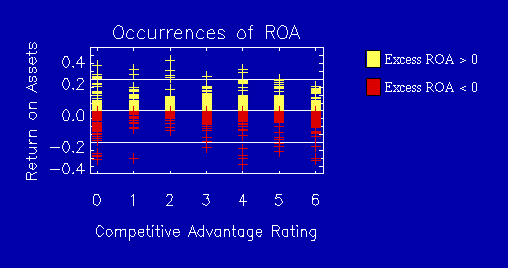
Competitive Advantage and Return on Assets
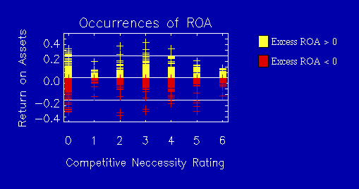
Competitive Necessity and Return on Assets
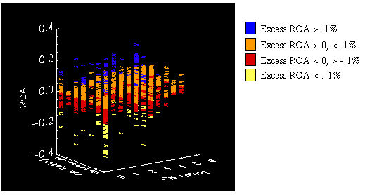
Click on the image to view an animation.
(Note: 638 Kb Quicktime movie playable on Macintosh
/ Windows machines.)
This three dimensional representation enables us to see the relationship between Competitive Necessity, Competitive Advantage and Return on Assets. The animation of this representation enables us to see the data points from all angles.
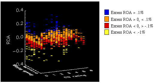
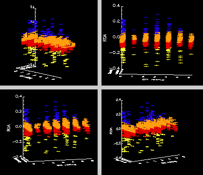
A three dimensional scatterplot of :
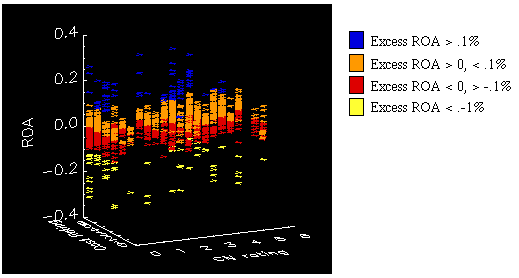
A three dimensional scatterplot of :
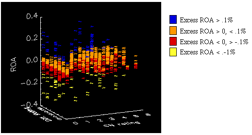
A three dimensional scatterplot of :
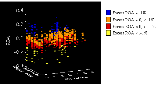
A three dimensional scatterplot of :
The use of three dimensional representations and animation enabled us to visualize the relationships within the data set. These representations provided more insight than did flat, two dimensional visualizations. The business data examined in this project is representative of the financial data analyzed by businesses and is an example of how businesses could apply visualization tools.
The visualization tools could, however, be more useful in rendering business data. The typical characteristics of business data, (sparseness and duplication) prevent us from using more advanced visualization tools such as volume rendering. while there are gridding routines available, in the case of this data set, these routines produced altered data that held little resemblance to the original information.
Additionally, the visualization tools currently require data manipulation by the user prior to rendering the visualizations. Users of financial data will require less involved (less programming) data interfaces.
Baddeley, A. (1992). Working Memory. Science, 255, 556-559.
DeSanctis, G. & Jarvenpaa, S. (1989). Graphical Presentation of Accounting Data for Financial Forecasting: An Experimental Investigation. Accounting, Organizations and Society, 14:5/6, 509-525.
Kaplan, S. E. (1988). An examination of the effect of presentation format on auditors' expected value judgments. Accounting Horizons, 2:3, 90-95.
Kosslyn, S. M., Chabris, C. F., Marsolek, C. J. & Koenig, O. (1992). Categorical versus coordinate spatial relations: computational analyses and computer simulations. Journal of Experimental Psychology: Human Perception and Performance, 18:2, 562-577.
Kosslyn, S. M. (1994). Image and Brain. Cambridge, MA: The MIT Press.
Lohse, G. L., Biolsi, K., Walker, N. & Reuter, H. H. (1994). A Classification of Visual Representations. Communications of the ACM, 37:12, 36-49.
Paivio, A. (1991). Dual Coding Theory: Retrospect and Current Status. Canadian Journal of Psychology, 45:3, 255-287.
I would like to thank the following individuals and organizations:
Dr. Ron Kriz, Director of the Scientific Visualization Laboratory, for his assistance and encouragement.
Gordon Miller, Director of the Multimedia Laboratory, for his pleasant, easy-going instruction.
Drs. Bob Brown and Jim Hicks for giving me the opportunity to work with this data set.
The Accounting Department at Virginia Tech for its financial support.
And to my husband Ron Hess, thank you for being supportive and forgiving while I was working on this project.
All of the visualizations in this project were created with PV-WAVE software. The programs are available for viewing.
 Click on the gobbler to go to my home page.
Last Revision - May 8, 1996
Home Page Project URL: //fbox.vt.edu:10021/T/thess/proj1.html
Class Project URL: http://www.sv.vt.edu/class/Student_Proj/class96/hess/hess.html