Due to the plasma nature of the ionosphere, the study of electromagnetic wave propagation and other processes can be a complicated issue. One way of modeling ionospheric processes is through the set of equations:
Equation 1 is known as the continuity equation, and equation 2 is known as the potential equation.
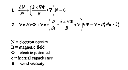
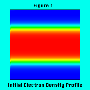
This set of equations was solved using a FORTRAN program running on an IBM RS/6000. The program uses a predictor-corrector algorithm incorporated with a combination of leapfrog and leapfrog-trapezoidal algorithms for time advancement. These are all spectral techniques, and represent a departure from the normally used finite-difference methods. It was desired that the results of the simulation would be for regions of turbulence to develop in the electron density. This result was achieved by initializing the electron density and the electric potential as hyperbolic tangent functions. Figure 1 and Figure 2 show the initial profiles.
Due to the size of the massive data sets generated in solving this set of equations, it is necessary to use a computer to visualize the processes that the data represents. One computer package that exists for visualizing such data is Advanced Visual Systems (AVS). Using AVS, running on an SGI several different views of both the electron density and the electric potential were generated.
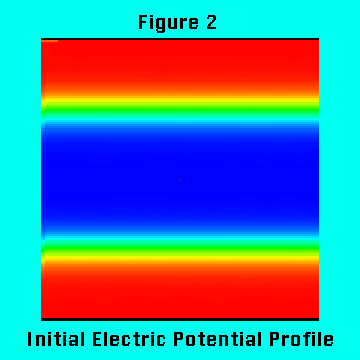
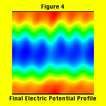
One of the ways of looking at the data was as a set of image profiles. Figure 3 shows the image profile of the electron density at the time of the simulation run. This view shows how, compared to the initial profile, vortices have begun to develop in the electron density. This "vortex street" is caused by gradients and instabilities in shear and wind velocities. However, Figure 3 also shows fringing occurring off of the vortices. These areas of fringing are actually a type of numerical instability known as Gibbs phenomena and should be discounted. Figure 4 is of the final electric potential profile. It can be seen that the electric potential has begun to develop into various bands of potential.
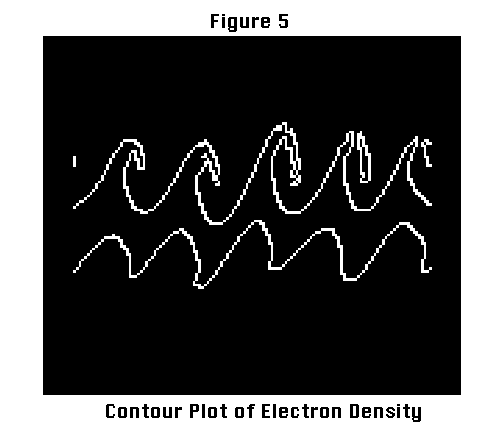
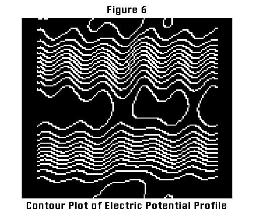
Another way of looking at these types of data sets is as a set of contour plots. Contour plots have been used often, historically, for visualizing these types of data sets. This is because they show a lot of information without taking up much computer resources. It is not very difficult to incorporate a routine for developing a contour plot into a FORTRAN program. As a consequence of their popularity, people have a familiarity with contour plots, and thus it was important to incorporate a set of contour plots into the visualization of the calculated data sets. The contour plots show less information than the image plots; however, the brevity of the contour plot actually makes it easier to see the most important information. Figure 5 shows a contour plot of the electron density. This figure is from the same time slice as the final image plot. From Figure 5 it is very evident that the electron density has begun to develop into vortices. Figure 5 consists of only one contour. This contour line is taken from a region of high density, and it is all that is needed to show how the vortices are developing. Figure 6 is a contour plot of the electric potential profile. It consists of twelve contours. This begins to get into the major drawback of the contour plot. Too many contour regions will quickly make the data into a big blur. This hasn't quite happened yet for Figure 6, and it is possible to see how the electric potential, in the middle of the frame, has begun to develop into various bands of potential.
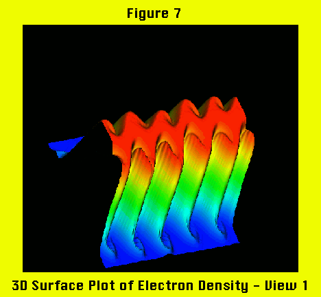
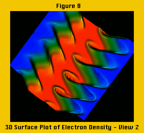
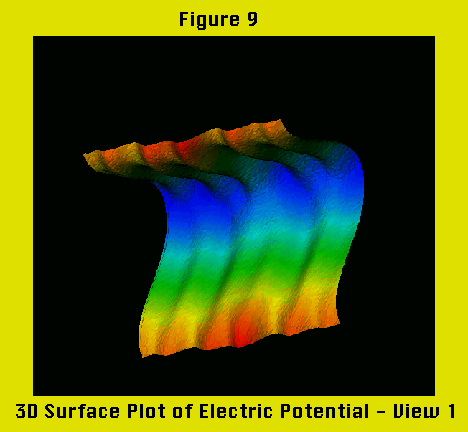
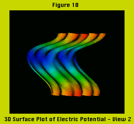
The final way that the data sets were looked at was as a series of 3 dimensional surface plots. These were created by taking the data, which was 2 dimensional, and mapping each data points intensity to the z-axis. The result is a visually appealing plot with the ability to show information that two dimensional plots cannot show. This is because the third dimension adds a new method of looking at the data: rotation. By rotating the surface, the data can be looked at from different angles. Some angles show certain information better than others. Figure 7 and Figure 8 are different views of the electron density. In Figure 8 the "vortex street" is much more pronounced than as seen by any other methods. Figure 9 and Figure 10 are both views of the electric potential surface plot, and they do an excellent job of showing the banding of the electric potential.
After compiling various large sets of images, it is necessary to organize them and present them in a coherent fashion. For such a task, multimedia presentation software packages are ideal. All of the data sets were transferred to a Macintosh Quadra 950. First the plots were animated, and then a multimedia module was developed.
The animation was done using Quicktime tools. All of the various plots were presented in a way that they showed how the plots developed in time. For the 3D surface plots this idea was extended by rotating and zooming in on the surface after it had finished developing.
Macromedia Director 4.0 was used to develop a multimedia module for final presentation. This module allows a user to learn a little bit about what the data sets represent, and to view all of the Quicktime movies that were generated. The Quicktime movies can be frame advanced both forwards and backwards, allowing the user to "navigate" through the graphics. Also the module's navigation structure allows for great flexibility in traversing between different movies.
Large data sets such as the ones developed in the modeling of ionospheric processes are best visualized using computers. Visualization packages allow for such data sets to be viewed in ways not possible before. This, coupled with an effective means of presentation (multimedia), will allow people to learn massive amounts of information about previously unexplored data sets.